

Tablet’s Color is more than just a visual detail. Two tablets. Same formulation, same dose, same efficacy. One has a clean, consistent blue; the other looks blotchy and mottled. Patients are more likely to trust the tablet that looks uniform and professionally manufactured.
That’s why Tablet’s Color carries more weight than many pharmaceutical quality checklists give it credit for. It can influence product identification, brand recognition, perceived quality, and patient confidence. In pharmaceuticals, color isn’t just decoration. It’s communication.
Pharmaceutical tablet’s color is a non-verbal trust signal, not a cosmetic choice. Patients, pharmacists, and regulators all use color to confirm product identity and dosage strength — patients recognize it, pharmacists verify it, regulators approve it against a specification. When color shifts batch-to-batch, even with an unchanged formulation, it reads as a red flag that triggers confusion, complaints, and non-adherence. Getting it right requires the correct colorant category for the application — water-soluble colors, organic lakes, or solvent-soluble colors — sourced with Color Index traceability and batch-to-batch consistency.
Patients Trust What Looks Familiar

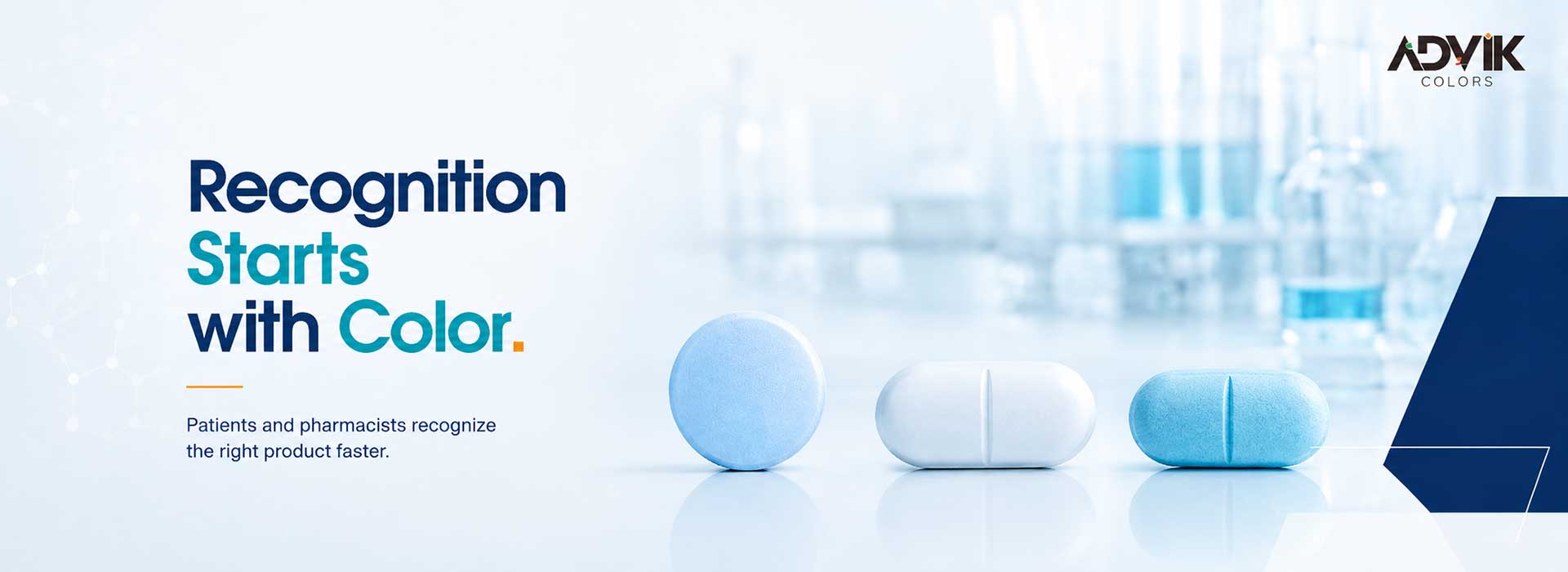
Patients associate color with identity and dosage, often more than they consciously realize. A person on long-term medication doesn’t read the label every refill — they recognize the tablet. The small blue pill for their blood pressure. The white one for cholesterol. The tablet’s color becomes shorthand for “this is correct,” faster than any text on the packaging.
So when that tablet’s color shifts — even slightly, even with the formulation completely unchanged — it reads as a red flag. Pharmacists field the “is this the right medicine?” calls. Patients skip doses out of uncertainty, or worse, stop refilling altogether because something “looks different.” None of that is a formulation problem. It’s a color problem, and it’s entirely preventable.
Consistent Batch
Recognized. Trusted. Clean, uniform color the patient has seen before — no phone call to the pharmacist, no skipped dose.
Off-Batch
Different. Questioned. Same formulation, same dose — but the visual mismatch alone is enough to trigger doubt.
Color Is a Communication System, Not a Design Choice
Regulatory bodies, pharmacists, and patients all use color as a fast, non-verbal cue for dosage strength, product identity, and brand trust — simultaneously, without coordinating with each other:
Patients
“This is my medicine.”
Pharmacists
“This matches what I dispensed last time.”
Regulators
“This batch is compliant with the specification on file.”
Three different audiences, reading the same signal, for three different reasons. When you choose a pharmaceutical colorant – whether it’s a water-soluble dye, an organic lake for coatings, or a solvent-soluble color for a specific formulation – you’re not picking a shade. You’re setting the terms of that three-way trust signal, batch after batch, for the life of the product.
The Science Behind the Shade: How Pharma Colorants Actually Work
Not all pharma colorants do the same job, and picking the wrong category for your formulation is one of the most common – and most avoidable – sources of downstream tablet’s color problems.
Water-Soluble
Dissolves for a Uniform Tint
Fully dissolves into the formulation — the go-to for syrups, oral solutions, and any liquid dosage form where an even, streak-free color is non-negotiable. Shades like FD&C Yellow 5, FD&C Red 40, and FD&C Blue 1 fall here, each tied to a Color Index (C.I.) number for a traceable spec.
Organic Lake
Insoluble Pigment for Opacity
Dye precipitated onto an aluminium substrate — built for tablet coatings, capsules, and dry blends where opacity and stability matter more than solubility. Lakes like FD&C Blue 1 Lake, Quinoline Yellow Lake, and Carmoisine Lake are engineered for batch-to-batch uniformity.
Solvent-Soluble
For Non-Aqueous Systems
Covers formulations where neither water nor an aqueous lake dispersion fits — certain film coatings, tablet-branding inks, non-aqueous preparations. Colors such as D&C Red 17 and D&C Violet 2 sit in this bracket.
⚠ Most Costly Formulation Mistake
Get the category wrong — a water-soluble dye where a lake was needed for opacity, say — and you don’t just get an off-shade. You get migration, bleeding, or uneven distribution: exactly the kind of mottled, inconsistent tablet that erodes patient confidence.
Three Jobs Color Is Doing in Your Product
1. Recognition — Same Product, Every Time
Consistent tablet’s color across batches lets patients and pharmacists instantly confirm they have the right medicine, at the right strength. Many manufacturers use color as an informal dosage-strength cue across a product line — lighter for a lower mg, deeper for a higher dose. Break that pattern with an off-batch tablet, and you’ve broken the cue the patient was relying on.
2. Differentiation — Standing Out on the Shelf and in the Mind
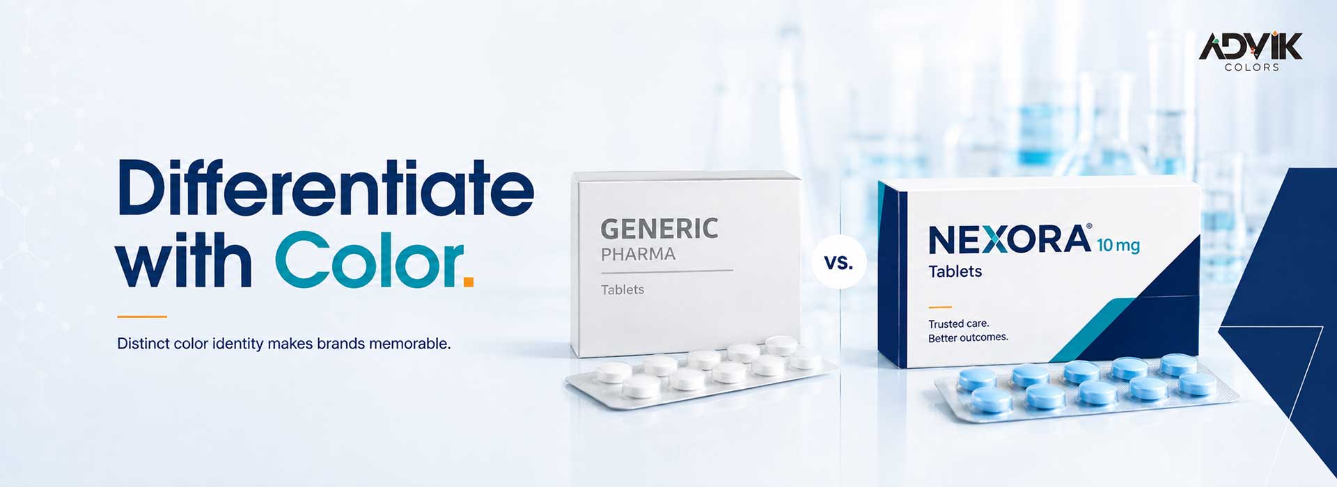
In a market crowded with generics, a distinct, well-managed tablet’s color identity is one of the few differentiators left that isn’t regulated out of your hands. A flat, generic-looking tablet reads as forgettable. The same molecule, presented with a deliberate, well-sourced color identity, reads as a brand worth requesting by name at the next refill.
3. Perception — Color Shapes Confidence
Patients unconsciously associate certain colors with strength, calmness, or urgency of treatment. This isn’t marketing folklore — it’s a well-documented pattern in how people relate to their medication. The wrong shade can quietly undercut confidence in the treatment itself, which in long-term therapies is directly tied to adherence.
The Real Failure Point: Batch-to-Batch Variation

Here’s what actually breaks trust in practice — not a bad color choice, but an inconsistent one. A tablet that’s a clean, uniform blue on the conveyor in January and a mottled, uneven blue-white by March isn’t a branding issue. It’s a tablet’s color variation problem that becomes a brand risk the moment a patient or pharmacist notices it. And they will notice — color is one of the first things a trained eye or a repeat patient catches, long before any lab result flags a deviation.
3
Audiences reading color as a signal
3
Colorant categories to specify correctly
1
Batch is all it takes to break trust
C.I.
Traceability required per shade
Variation like this rarely comes from the formulation team. It almost always traces back to the colorant itself: inconsistent particle size in a lake, batch-to-batch strength variation in a dye, poor dispersion during blending, or a supplier not holding a tight enough spec on incoming raw material. Serious manufacturers now rely on spectrophotometric measurement to quantify shade variation objectively — putting a number on what used to be a subjective “does this look right” check — and set color tolerances like any other critical quality attribute.
Reliable, regulation-compliant color solutions protect both patient trust and brand integrity — batch after batch. That means sourcing colorants (whether D&C Yellow 10, FD&C Blue 1, Carmoisine, or any Color Index–listed shade in your formulation) from a supplier who treats consistent, compliant, confident as the actual spec — not a nice-to-have.
Regulatory Reality: What “Compliant Color” Actually Means

“Approved colorant” isn’t a single global standard — it’s a patchwork your QA team has to navigate market by market. A shade cleared for use in one region isn’t automatically cleared in another, and the documentation trail matters as much as the tablet’s color itself:
- Color Index (C.I.) traceability — every shade should map to a specific C.I. number, removing ambiguity about exactly which colorant is in your formulation.
- Market-specific approval — FDA rules for the U.S., EU coloring agent rules, or pharmacopeial standards elsewhere (IP, BP, USP) aren’t interchangeable; what’s compliant depends on where the product ships.
- Certificates of Analysis, every batch — a supplier who hands over a COA tied to the same tested spec each time is the difference between a smooth audit and a scramble to explain a deviation.
- Consistency as a documented attribute — tablet’s color uniformity should be a tested, recorded quality parameter, not an informal visual check at the end of the line.
A lot of manufacturers get exposed here — not because they chose a non-compliant tablet’s color, but because they can’t fully trace or document what they used when a regulator or a customer asks. Getting this right isn’t one good batch — it’s a system: regulatory-compliant sourcing, the right colorant category for the application, and a supplier who treats tablet’s color as a technical spec rather than an afterthought. That’s the gap between manufacturers who occasionally field “is this the right medicine?” calls and ones who don’t.
Frequently Asked Questions
Why do pharmaceutical tablets have different colors?
Tablet’s Color helps patients and pharmacists visually distinguish between products and dosage strengths, supports brand recognition in competitive markets, and in some formulations helps mask taste-related cues. It’s functional, not just cosmetic.
What causes tablet’s color inconsistency between batches?
Most often it traces back to variability in the colorant itself — inconsistent particle size, poor dispersion, or a supplier not holding a tight batch-to-batch specification — rather than the core formulation.
Are pharmaceutical colorants regulated?
Yes. Colorants used in tablets and capsules must be approved and Color Index (C.I.) listed, meeting the regulatory standards — FDA, EU, or equivalent local pharmacopeial requirements (IP, BP, USP) — applicable to the market the product is sold in.
What is the difference between a water-soluble pharma color and an organic lake?
Water-soluble tablet’s colors dissolve into the formulation and suit liquid dosage forms like syrups and solutions. Organic lakes are insoluble pigments better suited to tablet coatings and capsules, where opacity and batch-to-batch stability matter more than solubility.
Get Color Right, Batch After Batch
Color Consistency Isn’t Just Visual — It’s Vital.
Advik Colors helps pharma manufacturers source pharmaceutical-grade colorants — water-soluble colors, organic lakes, and solvent-soluble colors — with the batch consistency and regulatory documentation your QA team can actually stand behind. Follow → Learn → Source Smarter.